A Cynic’s Guide to the 2014 White Out Shirt
White Outs are a Penn State tradition unlike any other. From the 2005 battle for the Big Ten title against Ohio State, to the decimation of Jimmy Clausen in 2007, to Allen Robinson’s legendary grab against Michigan, some of the greatest Penn State football memories have come when Beaver Stadium is cloaked in white. Moments this big deserve a shirt worthy of the game being played, and this year’s final four entries are now public for the official shirt. I’ll break them down for you and recommend which you should vote for. Here are the choices, in the order I would select them.
Option 1
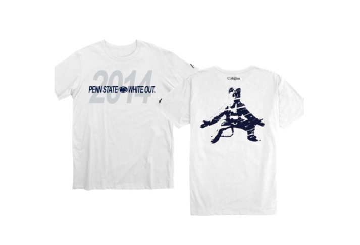
Option 1 is, in this writer’s humble opinion, the best of the bunch. The relatively simple Penn State White Out on the front on top of the year is a very sharp, clean look. The front of the shirt shouldn’t be overwhelming, which it is in too many of the other designs. It’s supposed to be a shirt for a White Out, so having the blue text stand out less with the white and grey shades being allowed room to breathe is effective. The back is excellent as well, with the awesome blue and white Nittany Lion silhouette and the graffiti stencil look giving the shirt a bit more depth. Overall, it’s the best design of the bunch.
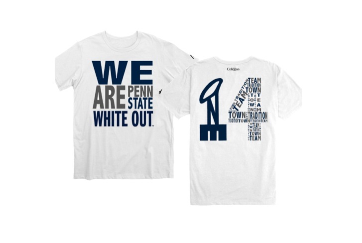
Option 2
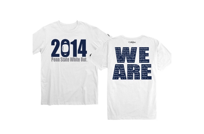
Option 2 kept the front relatively simple too, but maybe to its own detriment. Striking the balance between simple and boring is hard, and this may have just missed the mark. It’s a clean look for sure, but comes off looking a little bit too understated. A bit more going on would be nice, although I appreciate not overwhelming with color. The back, however, is fantastic. The blue We Are with Fred Lewis Pattee’s Alma Mater overlayed is a stroke of brilliance by the designer, and could make a great shirt on its own. This design deserves some consideration for sure, but it’s my second choice.
Option 3
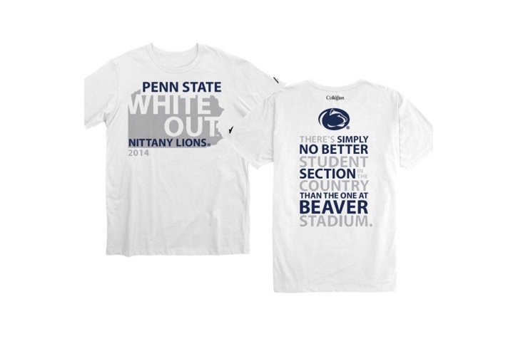
Oh, Option 3. I went back and forth on this one for a while before putting it in third place. I love the concepts behind it, but the execution was not quite as strong. The White Out text on the state of Pennsylvania was a nice touch, but the alignment of it was strange. So too for the Penn State and Nittany Lions texts, which just seems wholly out of place separated. Reading the shirt “Penn State White Out Nittany Lions 2014” just sounds strange, and is a case where maybe a more simple approach could have been justified. The idea was there, but the design was not. The back of the shirt was more of the same. That quote from ESPN.com’s Brian Bennett is one that was disseminated throughout the Penn State community shortly after it was published, and it’s a statement we all can agree with. However, the alternating font sizes and colors ruin it for me. some like that approach, I find it messy and a tad on the obnoxious side. Perhaps a smaller version of it with attribution to the author (or his medium) and quotation marks would have made it. Either way, another excellent idea that ultimate doesn’t quite live up to the thought behind it in its creation.
Option 4
Option 4 has some elements that could be successful, but ultimately it’s clearly not as strong a choice as the others. The front is another case of the alternating text sizes and colors being utilized poorly. The text is good although a bit obvious, but the look of it leaves a lot to be desired, and the blue and grey overpower the white. If this shirt was just the front, I’m sure plenty would buy it. However, the back is where the issues take place. In theory, implementing One Team and variations thereof is a smart decision. I’m sure the word “synergy” popped into the football marketing department’s heads as soon as they saw this design ala Lindsey Naegle. However, there are issues at hand. Let’s just get this out of the way: the “One” looks like a penis. You’ll never be able to un-see it now and we’ll leave it at that. Even if you disagree, you certainly see the Lombardi trophy. “Hey, football, that’s good!” may be your thought, until you remember that the Lombardi Trophy is given to the NFL champion, whereas the NCAA champion receives the Coaches’ Trophy (that crystal football you’ve watched Cam Newton kiss 100 times). Beyond that, the 4 is messy, cluttered with alternating colors and font sizes and awkward lettering. The idea is there again, but overall it’s just sort of a jumbled mess, and stands in stark contrast to a (relatively) simplistic front design.
Make sure to tell me I’m wrong in the comments. And remember to vote here.
Your ad blocker is on.
Please choose an option below.
Purchase a Subscription!
About the Author

Penn State 1996 Campus Shooter Denied Parole After 30 Years
Jillian Robbins maximum sentence ends in 2056.

Penn State Hoops Building Chemistry In Hopes Of Better Season
Penn State lost 10 players from the 2025-26 season and will rely on a lot of new faces.

Penn State Football Partners With Socios.com To Create Fan Tokens
The tokens will work as a type of fan membership.

A Bunch Of Words About College: Noel Purcell’s Senior Column
Noel’s senior column, is, well, something.