2012 White Out T-Shirt Design Review
Well, kiddos, it’s that time of year again. Time to determine the design that will grace thousands of white t-shirts at Beaver Stadium, many of them suffering brutal mutilation beforehand courtesy of our school’s female population.
Yes, I am actually endorsing something on the Collegian website, an extremely rare occurrence. However, I don’t want my student section looking like a bunch of tools, so I stress that you make voting for the 2012 White Out t-shirt design a priority before voting closes at 4:00 p.m. today. My trained eye (I spent a whole 45 seconds picking out my outfit today!) took a look at this year’s designs, and below are my thoughts on each.
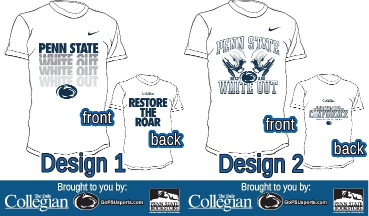
I love the big, bold lettering that resembles other shirts Nike has recently produced. The gray letters give it a nice contrast and help it stand out from most traditional blue and white Penn State gear, which I think the White Out t-shirt should do. Also, I’m a big fan of the “Restore The Roar” slogan for the next season(s). As a marketing major, I’m a sucker for a good tagline.
I’m not crazy about this one. The font says “cheap” to me, and the helmets don’t really impress me either. As for the back, normally anything containing a Joe Paterno quote will hit a home run with me, but I’m not sure it fits here. We will obviously never forget JoePa, but why not a Bill O’Brien quote? He’s certainly had some inspirational words about Penn State since his hiring, and it seems appropriate for his first season in Happy Valley.

Not bad. The front looks sharp and clean, but I’d like to see a little more originality. Yes, we have TRADITION, plenty of shirts say that. The graphic on the back looks cool, but the “Star Wars” lettering has to go.

Design 4 probably finishes last for me. The Lion throwing the football looks cool (Do we know if he has a good arm? Can he play quarterback? I’m not against putting him under center.), but I don’t like the circular base at all. The back contains the same font as the front of Design 2, and it doesn’t look any better.
The Verdict
Overall, while I wasn’t blown away by any of this year’s designs, they show a marked improvement from the previous few years. I would definitely take Designs 1 or 3 over the 2009 debacle, for sure. However, Design 1 dominates the rest of the field without question. The big, bold letters look great, and like I said above, I’m a fan of the “Restore The Roar” theme for the 2012 season, even if “the roar” might not actually come back this upcoming season. Often times, less is more, and Design 1 exemplifies that.
Which design do you like best? And, if you haven’t already, don’t forget to vote today until 4 PM!
Your ad blocker is on.
Please choose an option below.
Purchase a Subscription!
About the Author

Penn State President Neeli Bendapudi Criticizes Protect College Sports Act In Letter To Sen. John Fetterman
Multiple Big Ten and SEC schools have opposed the Save College Sports Act in the past week.

Penn State Baseball Pitcher Colin Fitzgerald Signs With Athletics As UDFA
Fitzgerald served as Penn State’s Friday starter in 2026 after transferring from Maine.

Penn State Baseball Transfer Portal Roundup: Where Former Nittany Lions Ended Up
These departing Nittany Lions are headlined by two pitchers heading to ACC powerhouses.

Nine Things You Don’t Know About The Lionettes
You see them break it down at Beaver Stadium or the BJC. You watch their hair flips and line kicks in awe. Now, get to know your Penn State Lionettes as they rapidly approach their biggest (and only) competition of the year.