“Whiteout Shirt” Without The ‘R’
I’m not the best graphic designer. I don’t use Photoshop, or any other fancy software. I’ve never taken a graphic design class in my life. I’m fully aware that there are people majoring in something that’s only my hobby, who are much, much, better than I could ever dream of being.
But apparently, none of those people decided to enter The Daily Collegian’s Whiteout T-shirt design contest. The Collegian just released the Final Four shirt designs, and when I looked at the designs I felt very underwhelmed by ones they’d selected. Were there other entries that were WORSE than these?
Here’s a look at the first chosen shirt.
Design #1

Besides the giant helmet randomly placed on the front, it isn’t THAT bad. Until you see the back, and there’s Rob Bolden’s old number (why??) and some extremely awkward spacing between the text and the number. The addition of the trademark at the end of “White Out” really rounds out this enticing design. Still, this is my favorite of the design options.
Design #2

I’m not entirely opposed to this design, but it may just stand out due to what it’s compared to. The front had an interesting pattern on the letters, and the back is…well, white. At least it saves on the screen-printing cost, leaving more money for the taking when these babies are marked up 200%.
Design #3

The text on the front screams of “WordArt”, found in any Microsoft program. The back features a beautiful partial helmet, which truly looks even more awkward than it sounds. The front alone may be tolerable, but the back just makes this shirt design weird.
Design #4

The fourth legitimate shirt contender really bugs me. This one features the EXACT same helmet as design one, in the EXACT same spot. However, the designer deviates and adds his or hers own spin, by copying the stripes on Northwestern’s jerseys. If that weren’t enough, there’s more WordArt-esq semi-circle text, with campy paw prints thrown about. This is probably my least favorite. Sorry to whoever designed it.
——————————————————————————————————————————————————————-
Since none of us at OS were particularly thrilled with any of the legitimate options presented above, we decided to make some of our own. Behold, the Onward State Whiteout Shirts that never made the cut.
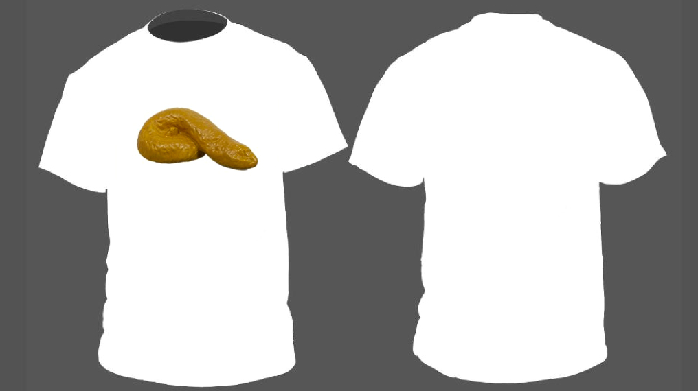
The Pre-School Michelangelo

This shirt features a high-quality graphic, resembling a preschooler’s artwork. Sadly it’s more interesting than any of the legitimate designs.
The Tramp-Stamp

Our next contender features a tramp-stamp, which scream’s “tough, yet ladylike”. The rest of the shirt is left blank, to truly embody the spirit of a “White Out”.
The Poor Font Choice

It happens to the best of us. You’ve got a killer design, and can’t settle for one font or another, and in a fit of rage, randomly select a font. You chose wrong.
“Whiteout Shirt” without the “R”
This design doesn’t hide what it is; it’s crap, plain and simple. (fits in with the current designs, eh?).
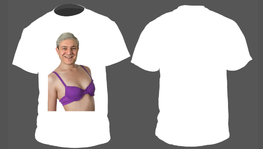
G-Span

We see here the classic Graham Spanier, forever timeless and classy. The purple brassiere creates a striking contrast with the white of Grahm’s pale torso, and the gray of his hair. (Shoutout to Eric Weiss for the original design).
The Plain White Tee
Behold, the Plain White T’s Plain White Tee. What better design for a white out than this classic, and refined look, modernized just a tad?

Finally, the only semi-serious design, which I finished in all of two minutes.
The Microsoft Powerpoint Design

Oddly enough, I like this design. If a sad excuse for a graphic designer like myself could do this in two minutes using only Microsoft Powerpoint, the potential for good submissions to the contest is huge. Unfortunately, they all fell flat, as the four finalists prove.
Since none of the finalists this year are good, Onward State has found a solution. This is our recommendation for the Official Unofficial 2013 White Out Shirt.
Your move, Collegian.
Your ad blocker is on.
Please choose an option below.
Purchase a Subscription!
About the Author

Brant Byers Returns Home With Competitive Edge For Penn State Hoops
After growing up watching Penn State guards Tony Carr and Andrew Funk, Byers now has the chance to make his own impact in Happy Valley.

’40 Pounds Bigger And Stronger’: Penn State Hoops’ Ivan Jurić Building Toward Sophomore Jump
Penn State’s sophomore center is setting himself up to take a big leap in year two.

Former Penn State Football Defensive Lineman Jordan Hill Named Director Of Penn State Football Letterman’s Club
Hill will take over for Wally Richardson, who held the title for 13 years.

Tom Corbett and Tom Wolf: What Do They Mean for Penn State?
Pennsylvania’s gubernatorial race is officially set, with Tom Wolf winning the Democratic nomination. Wolf will face incumbent Tom Corbett in November, with heavy implications for Penn State on the horizon. With the race set, we took a look at what each candidate means for Penn State.