University Finally Learns To ‘Keep It Simple, Stupid’ With New Penn State Go App
Steve Jobs’s emphasis on simplicity made Apple a generation-defining tech giant.
Users who were already adults when the first clunky computers appeared can now swipe, tap and scan their way to outcomes in seconds thanks to the personal computing revolution led by Apple and its visionaries.
One of the most iconic Jobs quotes that captures his thinking, and Apple’s approach to innovation, is “Simple can be harder than complex. You have to work hard to get your thinking clean to make it simple. But it’s worth it in the end because once you get there, you can move mountains.”
After watching Penn State’s technology evolve during my four years here with several iterations of LionPATH, at one point, the use of two course management systems, and most recently, an all-in-one mobile app, I can’t help but see the truth in what Jobs described.
For years, we’ve toiled as the university tried to develop effective 21st-century solutions. The goal has been to simplify things for students, but often, the result was far from that, including one “$66 million boondoggle” that erroneously admitted students, rejected tuition payments, crashed during the add/drop period, and required multiple updates during its first three years just to be deemed acceptable. Not to mention, in its original form, it looked like something that belonged on one of Apple’s original computers.


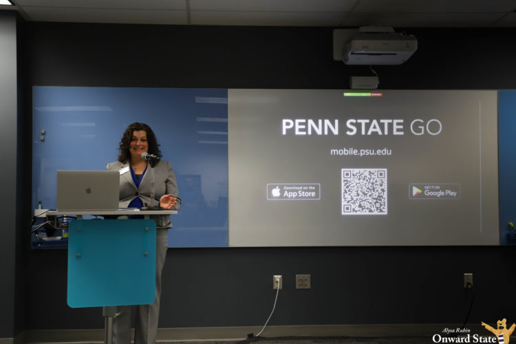
Now, though, with the new Penn State Go app, everything is (finally) as simple as it should be. The new app is a one-stop shop for pretty much every question you could have about the university, from how to get to your classes on the first day of school to if you have enough LionCash+ or meal plan money to get Chick-fil-A to if your adviser has a free appointment on Starfish for you to do a graduation checkout.
What makes Penn State Go so useful is its lack of bells and whistles. Very much like the home screens of the iPhones Jobs introduced to the world, the app really is just a page with several icons that link you to where you want to go. And as a result, the user experience is a lot simpler than the several different websites you used to need to log into separately or download a different app to view.
In the past, I’ve found myself frustrated with by hard it was to do simple tasks like checking the dining hall menu or set a meeting with my adviser, as so many of these features were previously hidden in all different corners of the internet. Now, they’re all conveniently in one place.
The new app is by no means perfect. And its team should certainly continue to modify it based on student feedback. A few areas in need of improvement that I’ve noticed include:
- To access Canvas or Athletics, you need to download an additional app. I’m unsure if these mobile apps just can’t be linked because they’re separate or if there’s a way to integrate their information, but I am all for making things as seamless and universal as possible.
- The maps feature offers plenty of useful information like construction in the area, building descriptions, and directions to anywhere on campus. However, other than the highlighted route on the map, the directions are pretty much useless.
- When I mapped out how to get to Beaver Stadium from my apartment, the app suggested taking 42 turns and only noted one landmark en route: Pattee Mall. Additionally, it said to take turns after distances like .01 miles that I’m not sure many pedestrians can figure out on their own.
- I think that on a college campus, there’s plenty of potential to create an intuitive navigational tool where you can be alerted by landmarks when street signs aren’t particularly useful (i.e. Walk up Pattee Mall, turn right after you pass Sparks and Burrowes Buildings, go through the stairs under the library, and turn right onto Park Avenue).
- The academic calendar doesn’t serve much of a purpose unless you’re wondering when you can apply for graduation or when your finals schedule will be released. It just has a few different deadlines and dates that might seem important, but aren’t always the most pressing questions on students’ minds.
- Is there a way to connect this with Canvas and your OrgCentral registrations to have an all-in-one calendar? Or a way to sync it to your phone’s calendar? That would probably prevent seniors from missing that upcoming deadline to submit their intent to graduate (Friendly reminder: Do that right now).
- The library feature isn’t too functional. It’s pretty much just the desktop library website, but what students are reading journal articles for class on their phones? I think a better use for this would be to cater the library feature more toward mobile users who would be more likely to reserve a room or borrow a book than read academic journals.
- The arbitrarily named Student Services feature presents an opportunity for Penn State Go to be made even simpler. The current icon is overloaded with links to everything from UHS and CAPS resources to fitness classes to OrgCentral to service and leadership opportunities. A lot of these could be deserving of their own icons And if developers are worried about overcrowding home screens, perhaps they could introduce an option that allows users to customize what features appear there.
Although that seems like a laundry list of complaints, I see the potential for this app. And less than four years after the debut of LionPATH, the university seems to have learned from its mistakes and made great user-experience its ultimate priority. When LionPATH was introduced, aside from the various technical malfunctions, three of the main criticisms against it were: “atrocious user interface,” “difficult navigation,” and “useless mobile app,” all areas that have since been addressed over time.
In comparison, Penn State Go serves its purpose and makes it easy to do what you need to do. And after more than one nightmare in this space, that’s saying a lot and might as well be equated to moving mountains.
Your ad blocker is on.
Please choose an option below.
Purchase a Subscription!
About the Author

James Franklin Says ‘Didn’t Get A Chance To Fix’ Penn State Problems
“Well, it’s unheard of because people have had challenges and had a chance to fix it.”

State College To Charge For Visitor Street Parking In Neighborhoods During Penn State Football Weekends
Good luck finding a free parking spot in State College this fall.


An Open Letter To My Sedated Self: Anthony Colucci’s Senior Column
“No challenge you encounter in college will come close to the obstacles you overcame to get there. However, that drive to do things your own way and disregard for what’s seen as ‘normal’ or ‘expected’ will carry on.”