A Brief History Of Pitt’s Panther Logos
As fun as it is to dump on Pitt all the time, we need to give them credit where credit is due. The Panthers do a lot of things right.
Their retro blue and gold is arguably one of the cleanest looks in all of college football. The script logo is as iconic as the greatest quarterback to never win a Super Bowl, Pitt alum Dan Marino — even if they forgot to dot the “i.”
Yet, the Panthers can’t for the life of them figure out a good secondary logo. Just take a look at some of the monstrosities the athletic department’s best graphic designers came up with over the years.
The Glory Days

There’s a lot to dissect with these throwback Panther logos. The 1959 logo is ironically the most accurate representation of Pitt’s football program today: a soft Panther with poor ball security.
The Panthers finally started to head in the right direction in the 1960s until they were presumably sued by Jaguar, the British car manufacturer, for copyright infringement and moved on to other, lesser designs.
The hyper-realistic 1977 sketch Panther is my personal favorite out of the bunch, but it probably also gave way too many kids nightmares and hurt the university’s enrollment in the early 90s. It legitimately looks like the cat would rip your throat out with no remorse.
Alas, you really have to wonder what Bill Weinstein was trying to achieve with his cartoon Panther logo. It looks like it auditioned for Wile E. Coyote’s role in the Looney Tunes but was rejected for being too stupid.
Microsoft Paint Panther

Officially called the “steel-cut Panther,” this logo makes me want to throw my Super Nintendo controller through the freaking screen because the graphics suck. I don’t know who Pitt hired to design this pixelated logo on Microsoft Paint, but I am 100% certain that this was included in his/her portfolio:
Derpy Dog Logo

I suppose this was intended to make up for the Microsoft Paint monstrosity, but Pitt owes every single fan and athlete that had to see and/or wear this logo a sincere apology. Every time I look at it, I know it’s supposed to be a Panther, but my brain instantly thinks of this dog:
Copycat (heh)

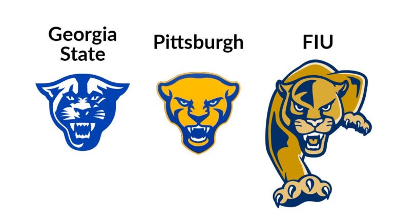
And that brings us to Pitt’s latest attempt at its Panther head, which looks like Georgia State and FIU’s logo had a baby. That baby’s life took an unfortunate turn when it realized it had to go to Pitt and was disowned by its parents. Hence why it looks so pissed off.
To be honest, the 1977 logo seemed way nicer. Bring it back!
Your ad blocker is on.
Please choose an option below.
Purchase a Subscription!
About the Author

Gavin McKenna Signs Entry-Level Contract With Toronto Maple Leafs
After one sensational year in Hockey Valley, McKenna is off to begin his NHL career.
Everything Gavin McKenna Has Done Since Being Drafted No. 1 In NHL Draft
He’s had an eventful couple of days in Toronto.

Man Facing Felony Charges After Injuring Penn State Student In A Hit-And-Run Crash
Noah Keister was under the influence of marijuana.

Golden Arches: Anthony Fiset’s Senior Column
Senior Anthony Fiset reflects on his most memorable experience from college — a debacle at McDonald’s his freshman year.